CoolPoll v. 1.0.3 - Красивые результаты опроса CSS3
 Добавлено: 03 авг 2013, 08:44
CoolPoll v. 1.0.3
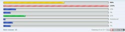
Результаты опроса с красивой цветной анимацией.
Работает на всех современных браузерах.
Цвета:
0-19% - синий
20-39% - зеленый
40-59% - желтый
60-79% - оранжевый
80-100% - красный
styles/prosilver/template/viewtopic_body.html
Найти:
Заменить на:
Найти:
Заменить на:
styles/prosilver/theme/colours.css
Найти:
Добавить после:
Выглядит вот так:
Сделано на основе Smayliks () и Татьяна5.
Результаты опроса с красивой цветной анимацией.
Работает на всех современных браузерах.
Цвета:
0-19% - синий
20-39% - зеленый
40-59% - желтый
60-79% - оранжевый
80-100% - красный
styles/prosilver/template/viewtopic_body.html
Найти:
- Код: Выделить всё
<!-- IF S_DISPLAY_RESULTS --><dd class="resultbar">
Заменить на:
- Код: Выделить всё
<!-- IF S_DISPLAY_RESULTS --><dd class="resultbar"><div class="meter">
Найти:
- Код: Выделить всё
{poll_option.POLL_OPTION_RESULT}</div></dd>
Заменить на:
- Код: Выделить всё
{poll_option.POLL_OPTION_RESULT} </div></div></dd>
styles/prosilver/theme/colours.css
Найти:
- Код: Выделить всё
.rtl .pollbar5 {
   border-left-color: #D11A4E;
}
Добавить после:
- Код: Выделить всё
/* CoolPoll ()
-----------------------------v.1.0.3--- */

.pollbar1 {
   background-color: #4069D1; /* blue */
   background-image: linear-gradient(
   135deg, rgba(0, 0, 128, 0.2) 25%,
   transparent 25%,
   transparent 50%,
   rgba(0, 0, 128, 0.2) 50%,
   rgba(0, 0, 128, 0.2) 75%,
   transparent 75%,
   transparent);
}

.pollbar2 {
   background-color: #2BC253; /* green */
   background-image: linear-gradient(
   135deg,
   rgba(84, 240, 84, 0.2) 25%,
   transparent 25%,
   transparent 50%,
   rgba(84, 240, 84, 0.2) 50%,
   rgba(84, 240, 84, 0.2) 75%,
   transparent 75%,
   transparent);
}

.pollbar3 {
   background-color: #FFD800; /* yellow */
   background-image: linear-gradient(
   135deg,
   rgba(216, 177, 0, 0.2) 25%,
   transparent 25%,
   transparent 50%,
   rgba(216, 177, 0, 0.2) 50%,
   rgba(216, 177, 0, 0.2) 75%,
   transparent 75%,
   transparent);
}

.pollbar4 {
   background-color: #f1a165; /* orange */
   background-image: linear-gradient(
   135deg,
   rgba(243, 109, 10, 0.2) 25%,
   transparent 25%,
   transparent 50%,
   rgba(243, 109, 10, 0.2) 50%,
   rgba(243, 109, 10, 0.2) 75%,
   transparent 75%,
   transparent);
}

.pollbar5 {
   background-color: #f0a3a3; /* red */
   background-image: linear-gradient(
   135deg, rgba(244, 35, 35, 0.2) 25%,
   transparent 25%,
   transparent 50%,
   rgba(244, 35, 35, 0.2) 50%,
   rgba(244, 35, 35, 0.2) 75%,
   transparent 75%,
   transparent);
}

@keyframes move {
  from { background-position: 0 0; }
  to   { background-position: 100px 50px; }
}

@-webkit-keyframes move {
   0% {background-position: 0 0;}
   100% {background-position: 100px 50px;}
}

.meter {
   background-color: #E0E3E0;
   height: 15px;
   padding: 1px !important;
   margin: 0;
   -moz-border-radius: 5px;
   -webkit-border-radius: 5px;
   border-radius: 5px;
   -moz-box-shadow: 0 1px 5px #000 inset, 0 1px 0px #fff;
   -webkit-box-shadow: 0 1px 5px #000 inset, 0 1px 0px #fff;
   box-shadow: 0 1px 5px #000 inset, 0 1px 0px #fff;
}

.meter > div {
   position: relative;
   height: 100%;
   padding: 0 !important;
   border: none;
   border-top-right-radius: 3px;
   border-bottom-right-radius: 3px;
   border-top-left-radius: 3px;
   border-bottom-left-radius: 3px;
   box-shadow:
      inset 0 2px 9px  rgba(255,255,255,0.3),
      inset 0 -2px 6px rgba(0,0,0,0.4);
   overflow: hidden;
    animation: move 3s linear 0s normal none infinite ;
   -webkit-animation: move 3s linear infinite;
   background-size: 50px 50px;
}
Выглядит вот так:

Сделано на основе Smayliks () и Татьяна5.